Selected Press
Exhibition Review of Perceptions and Movements Exhibition (Percepções e Movimentos) by Cláudia Handem for ArteCapital
https://www.artecapital.net/exposicao-811-colectiva-percepcoes-e-movimentos
Galeria Presença, Porto, Portugal
20/01/2024-09/03/2024
Curated by Constança Babo
https://www.artecapital.net/exposicao-811-colectiva-percepcoes-e-movimentos
Galeria Presença, Porto, Portugal
20/01/2024-09/03/2024
Curated by Constança Babo
PERCEPÇÕES E MOVIMENTOS
GALERIA PRESENÇA (PORTO)Rua Miguel Bombarda, 570
4050-379 Porto
20 JAN - 09 MAR 2024
De uma simplicidade tocante, Percepções e Movimentos “emerge (…) do intuito de convocar e, de certo modo, reativar os territórios de ação e expressão desenvolvidos e partilhados pela op art e kinetic art (…)”, refere Constança Babo, curadora da exposição, na folha de sala na Galeria Presença. No entanto, vê-la somente à luz das suas especificidades conceptuais e plásticas é redutor e, por isso, “propõe-se um discurso e uma abordagem amplos e atuais”.
A ótica e o movimento continuam a ser centrais na prática artística contemporânea, e não se deve considerar este atual como derivado de uma atualização. Pelo contrário, decorre de uma sequência histórica mutável que tem vindo a explorar as inesgotáveis propriedades (e possibilidades) da matéria, da composição e da tecnologia em função da estimulação dos nossos modos perceptivos. Recordo a exposição derivada do mesmo tema - The Dynamic Eye: Beyond Optical and Kinetic Art -, no Atkinson Museum em Vila Nova de Gaia, entre Julho e Novembro de 2023. A mostra de uma centena de obras da coleção da Tate Modern, exemplares da arte ótica e cinética que revolucionam a esfera do pictórico, veio reforçar e reposicionar estas duas correntes artísticas no discurso contemporâneo, afirmando-se como antecedente do digital e virtual no modo de fazer e ver arte hoje.
A arte cinética e ótica, reconhecidas enquanto tais a partir dos anos 50 e 60 do século XX, e geralmente referidas em conjunto, caracterizam-se pela criação de efeitos óticos que colocam o olhar em dúvida quanto à estabilidade da imagem ou objeto. A inclusão do movimento – aparente ou real - foi determinante para estimular o olho e a experiência sensorial, espacial e temporal da obra de arte. A ilusão ótica, com os seus mecanismos de persuasão e distorção pictórica, recorria a cores saturadas, geometrias dialogantes e padrões. Também eram comuns opções como intensificar os efeitos lumínicos e/ou sonoros de uma peça com a inclusão da máquina, de forma a desmaterializar a estrutura do objeto e converter uma anterior experiência visual estática numa dinâmica. A relação entre arte e ciência é inequívoca, compreendendo um alargado campo de estudos que vão desde a psicologia aos avanços da robótica.
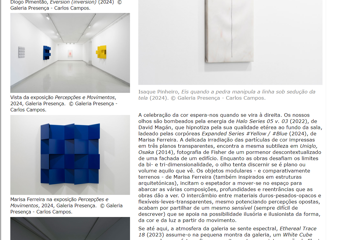
Na Galeria Presença, Constança Babo propõe uma seleção contemporânea que bebe dessa herança, partindo de artistas vivos representados pela galeria e artistas convidados. As obras de Diogo Pimentão, Isaque Pinheiro, Lia Chaia, Marisa Ferreira, Roland Fischer, Carlos Mensil, Angelika Huber e David Magán compõem um grupo inteligente, variado e esteticamente sofisticado, que faz esquecer, por momentos, os artistas enquanto criadores. As peças dissimulam a marca da mão humana (salvo Diogo Pimentão e Carlos Mensil na última sala) através de formas depuradas, transições cromáticas subtis, uso do ready-made, e de meios definidos por dispositivos mecânicos – a fotografia, o vídeo, o motor. Além disso, as obras imanam uma dimensão poética difícil de ignorar e o espectador fica mudo ao contemplar as obras. Quando se fala, murmura-se. Se alguma vez a arte ótica/cinética suscitou uma reação audível própria da surpresa ou do inacreditável, o conjunto aqui apresentado caracteriza-se por um espanto silencioso de quem vê algo frágil, precioso e raro.
As obras organizam-se no espaço segundo coincidências que o espetador vai adivinhando. Começa-se em grisalha ou preto&branco (numa possível homenagem aos inícios da op art) com obras de Huber, Pimentão, Pinheiro e Fischer, refutando a ideia de que é necessária a cor para ativar a visão. Reconhece-se uma desmaterialização (conceptual ou efetiva) das obras em três partes, como uma Santíssima Trindade. Huber apresenta In motion, walk again (2024), integrada na série Kinetic Stories, - em que faz uso de três obsoletos split-flap para colocar em andamento três películas de tons monocromáticos. A conjugação entre rotatividade, verticalidade e horizontalidade dos planos, reportam a várias imagens, como janelas, escadas, planos iluminados ou em sombra. O som das películas em movimento ressoa em Eversion (inversion) (2024), de Pimentão, que imobiliza esse encadeamento com o rasto petrificado de “três barras de grafite” em grande escala, no tempo do desenho. Em frente, Eis quando a pedra manipula a linha sob sedução da tela (2024) traz à Memória #2 (2019), de Isaque Pinheiro, o questionamento do que pode ser ainda o ofício do desenho, da pintura e da escultura subvertendo os materiais e os gestos aos objetos distintivos da disciplina protocolar a que correspondem.
A celebração da cor espera-nos quando se vira à direita. Os nossos olhos são bombeados pela energia de Halo Series 05 v. 03 (2022), de David Magán, que hipnotiza pela sua qualidade etérea ao fundo da sala, ladeado pelas corpóreas Expanded Series #Yellow / #Blue (2024), de Marisa Ferreira. A delicada irradiação das partículas de cor impressas em três planos transparentes, encontra a mesma subtileza em Uniqlo, Osaka (2014), fotografia de Fisher de um pormenor descontextualizado de uma fachada de um edifício. Enquanto as obras desafiam os limites da bi- e tri-dimensionalidade, o olho tenta discernir se é plano ou volume aquilo que vê. Os objetos modulares - e comparativamente terrenos - de Marisa Ferreira (também inspirados em estruturas arquitetónicas), incitam o espetador a mover-se no espaço para abarcar as várias composições, profundidades e reentrâncias que as obras dão a ver. O intercâmbio entre materiais duros-pesados-opacos e flexíveis-leves-transparentes, mesmo potenciando percepções opostas, acabam por partilhar de um mesmo sensível (sempre difícil de descrever) que se apoia na possibilidade ilusória e ilusionista da forma, da cor e da luz a partir do movimento.
Se até aqui, a atmosfera da galeria se sente espectral, Ethereal Trace 18 (2023) assume-o na pequena montra da galeria, um White Cube que recebe uma fotografia que se situa entre uma intervenção de Flavin e uma aurora boreal. O fenómeno da luz continua, ainda hoje, sedutor e misterioso, sempre capaz de nos surpreender.
Na quarta sala (curiosamente, a da quarta dimensão) juntam-se as obras permanentemente in motion: a performance de Pimentão em Returned (2012) caracteriza-se pelo gesto repetitivo de pressionar uma chapa circular com os dedos, quando a marca dessa ação torna a desaparecer assim que o ricochete do material se faz ouvir; metáfora do que pode representar “a natureza efémera e transitória do ato de criação”; Átomo (2020), de Lia Chaia, projeta o movimento infantil de pequenos berlindes dentro de uma espiral desenhada com pregos, fazendo-nos duvidar se é apenas o seu encontro umas nas outras que as faz rolar; Por fim, Carlos Mensil apresenta 16:9 (2022) ao lado de um Sem Título (2016) ainda tímido, uma peça que marca a introdução do aço inoxidável na sua prática. O formato panorâmico que gira sobre si mesmo capta as demais atenções, e tem o condão (as projeções lumínicas assim o ditam) de prolongar ou encurtar o tempo se optarmos em rodar também com ele, no mesmo ou no sentido contrário, respetivamente.
Termina-se a exposição com esta dança entre dois amantes – o Homem e a Arte -, sem previsões de alguém desviar o olhar ou findar o passo. (Até 9 de Março).
Cláudia Handem (n. 1992, Murtosa) Licenciada e mestre em Arquitetura pela Faculdade de Ciências e Tecnologia da Universidade de Coimbra, e licenciada em Artes Plásticas - Pintura pela Faculdade de Belas Artes da Universidade do Porto. Desenvolve prática artística no campo do desenho e da pintura, e escreve, de forma independente, sobre exposições de arte.

Press review screenshots, ArteCapital, 2024
Exhibition Review of Perceptions and Movements Exhibition (Percepções e Movimentos) by Ana Martins for UmbigoMagazine
https://umbigo.space/en/ongoing/percepcoes-e-movimentos-exposicao-coletiva-na-galeria-presenca-67ebfa59b453563eb1f17291
Galeria Presença, Porto, Portugal
20/01/2024-09/03/2024
Curated by Constança Babo
https://umbigo.space/en/ongoing/percepcoes-e-movimentos-exposicao-coletiva-na-galeria-presenca-67ebfa59b453563eb1f17291
Galeria Presença, Porto, Portugal
20/01/2024-09/03/2024
Curated by Constança Babo
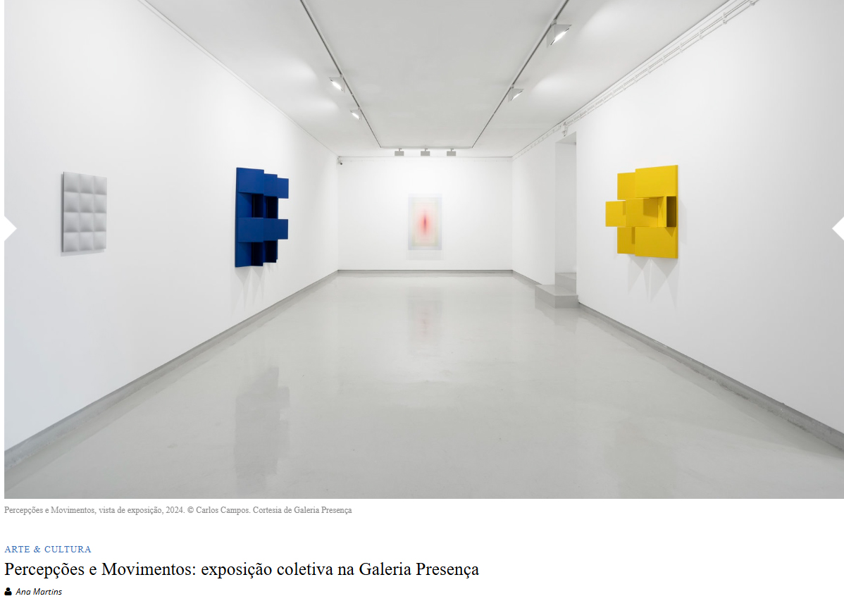
Percepções e Movimentos, curated by Constança Babo and held at Galeria Presença, is based on Kinetic Art and Optical Art – mid-20th century modernist avant-garde currents -, introducing their notions and aesthetic principles to contemporary times in a dialogue between works by Angelika Huber, Diogo Pimentão, Isaque Pinheiro, Roland Fischer, Marisa Ferreira, David Magán, Lia Chaia and Carlos Mensil. Through careful, coherent and refined editing, the exhibition addresses issues of oticity, movement, space, form and colour, whilst also drawing on minimalist thinking and artistic practices.
The curator, in the exhibition text, states: “The exhibition Percepções e Movimentos comes from the intention of bringing together and, to a certain extent, reviving the areas of action and expression developed and shared by op art and kinetic art. We recognise, nonetheless, the historical timing and the formal, visual and plastic particularities of both artistic currents. Consequently, although the exhibition project adopts them as a starting point and background, it does not limit itself to their specificities. Rather, it offers a broad and current discourse and approach.”
Starting from the 1960s, according to Western art history, some artists, influenced by the avant-gardes of the early twentieth century, such as Dadaism, Futurism, Constructivism or Abstractionism, as well as the ideas of the Bauhaus School, turned to a notion of dialogue between art and technology. Kinetic art was an artistic movement from the second half of the previous century, pioneered by a group of artists in the context of the exhibition The Movement (1955) at the Denise René Gallery in Paris. Influenced by research into psychology, Albert Einstein’s Theory of Relativity (1905-1915) or Maurice Merleau-Ponty’s study Phenomenology of Perception (1945), their creative approach was to prioritise the movement of water, wind, light or magnetism. CYSP 1 (1956) by Nicolas Schöffer, Homage to New York (fragment) (1960) by Jean Tinguely, or Ballet de Luz Automática (1962) by Otto Piene are notable for how they stretch the pieces in space and time, introducing a new layer to the viewer’s experience, but also for the way they embody mechanical movement, allowing for an analogy between the human body and the machine. Op art, or optical art, was most widespread in painting, where artists made purely geometric shapes to create optical effects, inspired by Goethe’s Theory of Colours (1810), Merleau-Ponty’s psychology of perception, but also Georges Seurat’s pointillism, Robert and Sonia Delaunay’s paintings, as well as those of Josef Albers. Vega 200 (1968) by Victor Vasarely, Corrente (1964) by Bridget Riley, or Grande Parede Panorâmica (1966) by Jesús Rafael Soto are outstanding for their contrasting geometric figures and colours, pushing our eyes to perceive two contradictory elements, resulting in a sense of movement, convexity or concavity, in short, an optical illusion, constantly renewed as we move through the artworks.
In Percepções e Movimentos, Angelika Huber presents In Motion, walk again’ (2024), a ready-made based on three split-flap dials. Recontextualising these devices usually seen in airports or train stations and featuring alphanumeric text, the Austrian artist makes their movement, sound and temporality stand out in the exhibition space. Next door, Diogo Pimentão’s proposal, Eversion (inversion) (2024) emerges from the gallery wall as three radiating blocks, as if they were graphite lines extending beyond the paper, providing an optical illusion, a 3D notion to the drawing, but also an idea of movement, as we move around the space. Across the hall, Isaque Pinheiro shows Memória #2 (2019) and Eis quando a pedra manipula a linha sob sedução da tela (2024), a continuous gesture in her body of work, either through the way she gives the illusion of subtlety and fluidity to marble, harking back to classism, or by taking it back to contemporaneity through abstract, conceptual and geometric compositions. Meanwhile, Roland Fischer, one of today’s most important German photographers, presents Uniqlo, Osaka (2014) in the second room. This is a detailed photograph of the Japanese building, enhancing its geometric features, stripping away its context and returning to its purest lines. By contrast, Marisa Ferreira shows us Expanded Series (blue) and Expanded Series (yellow), inspired by minimalism and the memories of vacant industrial buildings in the Ave region. Marisa’s pieces are permeated by juxtaposing geometric figures, by the serial nature of the shapes, but also by the illusion that their three-dimensionality gives us, by how lively the primary colours are and by the notion of rhythm as they pass through. David Magán’s Halo Series 05 v 03 (2023) suggests light halos in space by digitally printing layers of primary tones in gradation, protruding from the wall of the exhibition space like pulsating colours, shapes and light. Finally, Ethereal Trace 18 (2022-2023) is on display in the gallery window.
The last room shows Diogo Pimentão’s video Retornar (2012), in contrast to Lia Chaia’s video Átomo (2020). Both emphasise circular motions, magnetism and the action of physics against the elements, following on from Carlos Mensil’s pieces: Sem título (2016), a triptych structure in stainless steel, starting from the wall and creating different shapes as one moves around the gallery, and 16:9 (2022), a suspended drawing-object made from the same material but using a motor, a wooden box and light, hypnotising us with its circular flow and the new forms that emerge, especially the light reflections in the exhibition area.
Overall, the exhibition, based on the contemporary artistic works it exhibits – namely its geometric shapes, colours, abstraction, optical illusion, but especially the way it encourages the viewer to move through space, reshaping formats, rhythms and perceptions – restores to the present some of the premises of kinetic art, optics and minimalism, in an act that is itself contemporary, by continually reformulating, stating or updating previous artistic practices.
Percepções e Movimentos, curated by Constança Babo, is on show at Galeria Presença, in Porto, until March 9, 2024.
Press review screenshot, UmbigoMagazine, 21st February 2024
Text about An Archive of Evidence by
Brynhild Grødel Winther for Contemporary Art Stavanger (CAS), 24/01/2023
https://contemporaryartstavanger.no/archive?author=brynhild-grodel-winther
Hå Gamle Prestegård, Norway
12/11/2022-15/01/2023
(In Norwegian)
https://contemporaryartstavanger.no/archive?author=brynhild-grodel-winther
Hå Gamle Prestegård, Norway
12/11/2022-15/01/2023
(In Norwegian)
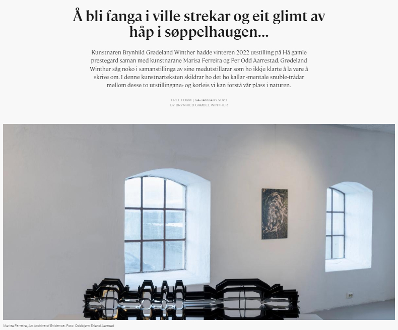
“I utstillinga «An Archive of Evidence» av Marisa Ferreira, blir eg først møtt av noko som liknar rituelle objekt. Kvite, flate skulpturar på ein mørk grøn vegg. Dei er laga i eit materiale eg ikkje klarar identifisere. Det liknar marmor, men er noko anna. Det kvite blir halde saman av sveisa og bøygd aluminium som dannar sølvfarga linjer som er symbol eller arbeidsteikningar for borrhovud frå oljeindustrien, eller… Eller kanskje er dei komponentar til fartøy som kan frakte mennesket vidare til andre planetar når alt håp er brukt opp. Håp er ei råvare som liksom ikkje kan lausrivast frå måten me ser oss sjølv og vår plass i naturen.
Eg får høyre at objekta på veggen er laga av avfallsstoff etter utvinning av litium. Eit grunnstoff som blant anna blir brukt i batteri i el-bilar. Etter å ha vore ute og henta avfall ser Ferreira på partiklane i mikroskop og sorterer vekk biologisk materie, stein og anna som ikkje kan blandast til den glas-harde massen ho ynskjer. Det er her eg kjenner optimisme spire ut frå måten kunstnaren har omdanna avfall til visuell magi. Kva andre moglegheiter kan ein finne i industriavfall? Ho fortel at ein i dag berre resirkulerer om lag 9% av det globale industriavfallet.
Det hurtig aukande overforbruket av el-bilar krev enorme naturressursar. Utstillinga inneheld òg fleire foto av sår i landskapet der ein har vunne ut dette grunnstoffet som liksom skal bidra til å «redde klimaet». Som teikna strekar i landskapet snirklar vegar seg inn mot gapande open jord. Ein annan dag ein plass inni datamaskina las eg at el-bilar ikkje er funne opp for å redde kloden, men for å redde bil-industrien. Noko eg blir meir bevisst på i denne utstillinga utan at kunstnaren har uttalt det. Her i landet får el-bilane oss til å sjå bra ut i klimastatistikkane sidan me ikkje produserer bilane sjølv. Statistikkane viser nemleg berre produksjon og seier ingenting om forbruk. Her kjem òg ein slags ny-kolonialistisk logikk inn, for på den sida av kloden kor vekta av pengane ligg tyngst kan ein auke forbruket og kjøpe fleire el-bilar og el-syklar utan at den naturøydeleggande produksjonen blir synleg i våre statistikkar. Utslepp og naturinngrep utanfor landegrensene blir utelete frå vårt ansvar. Men alt ein produserer treng råvarer frå naturen. Inkludert kunst.
På golvet bak meg ligg ein skulptur i mørkt metall. Forma er danna av repetisjonar av ein profil. Det er noko uhandgripeleg ved desse skulpturane som ligg her fysisk og tungt i rommet. På underleg vis svever dei mellom fortida og framtida. Undrande. Opnande. Skulpturane til Ferreira er som innkapsla håp om at mennesket kanskje kan endre retning. Det rituelle preget i nokre av dei kviskrar kanskje om at ein må velgje å tru. Og så lenge ein trur finst det kanskje håp, så lenge ein leitar etter løysingar utanfor allfarveg.
Don’t waste the future…waste is the future!”
Review ARCOLisboa by Constança Babo for ArteCapital
https://www.artecapital.net/estado-da-arte-143-constana-a-babo-arcolisboa-uma-feira-de-arte-contempora-nea-em-perspetiva
Galeria Presença
https://www.artecapital.net/estado-da-arte-143-constana-a-babo-arcolisboa-uma-feira-de-arte-contempora-nea-em-perspetiva
Galeria Presença
ARCOLISBOA, UMA FEIRA DE ARTE CONTEMPORÂNEA EM PERSPETIVA
CONSTANÇA BABO, 2023-06-03As feiras de arte têm vindo a consolidar a sua centralidade e a sua importância na esfera da arte. Instituídas enquanto espaços de desenvolvimento cultural, troca, conhecimento e debate, consistem, igualmente, em modelos expositivos inovadores e propícios ao cruzamento de diferentes plásticas, práticas e culturas. Enquanto tal, e sendo tão locais quanto globais, de escalas internacional, transnacional ou multinacional, as feiras convocam questões tais como a globalização, a par da transdisciplinaridade e da hibridez da própria criação artística contemporânea. De acordo com esta amplitude, dirigem-se aos mais variados públicos, habitués ou não das artes, residentes e estrangeiros.
Um caso relevante é a ARCO, feira internacional de arte contemporânea fundada em Madrid e cuja edição portuguesa, organizada pela IFEMA Madrid e pela Câmara Municipal de Lisboa, celebrou, este ano, a sua sexta edição.
Nesta, assinale-se, dentro da programação paralela, uma conferência dedicada à Rede Portuguesa de Arte Contemporânea, com o intuito de dinamizar e internacionalizar a criação portuguesa, e o espaço ArtsLibris, dedicado a revistas, edições de artista, foto livros e publicações digitais.
A mais recente ARCOlisboa decorreu entre os passados dias 25 e 28 de maio, na Cordoaria Nacional, reafirmando-se enquanto ponto de encontro de galeristas, artistas, colecionadores e outros profissionais de arte.
Demonstrou, uma vez mais, tratar-se de uma ocasião valiosa justamente tanto para os que se movem no campo das artes, como para um público que pretenda conhecer exemplares interessantes da produção artística atual, mediante uma perspetiva menos formal e regulamentada, mais livre, dinâmica e próxima, do que se possibilita convencionalmente no contexto institucional.
Como anunciado, esta edição da feira teve o objetivo de apresentar “um panorama da cena artística portuguesa, num amplo diálogo com a arte espanhola e europeia, acompanhada de uma seleção criteriosa de artistas africanos”. Aumentou, uma vez mais, o número de galerias participantes, totalizando-se oitenta e seis, das quais vinte e cinco eram portuguesas e sessenta e uma estrangeiras. Das novas participações europeias indiquem-se Carlier | Gebauer, de Berlim, e a austríaca Elisabeth & Klaus Thoman.
Reencontraram-se inúmeras galerias nacionais e embora algumas tenham investido em conceituados artistas internacionais, como foi o caso de Cristina Guerra com Lawrence Weiner, denotou-se, sobretudo, e como é devido, a representação de fortes nomes portugueses. Destaquem-se a Bruno Múrias com Rui Calçada Bastos, a Fernando Santos com Gerardo Burmester e Manuel Rosa, a Francisco Fino com a incontornável Helena Almeida, através da série Dentro de mim (2018), a Presença com Inês D’Orey, Marisa Ferreira e Maria Trabulo, e a Vera Cortês, vencedora do prémio Millennium para melhor stand, com três imponentes esculturas de António Bolota, Peça #1,#2 e #3 (2023).
Sobre as galerias espanholas, urge apontar a Fernando Pradilla, com obras do ASA - Ateliê Sandra Albano. As magníficas fotografias de Albano Afonso e os elegantes desenhos de Sandra Cinto, ambos concebidos a partir da flora do Jardim Botânico do Rio de Janeiro, ecoavam, em íntima sintonia e diálogo, para lá da circunscrição do stand.
Sublinhe-se, igualmente, a presença das galerias africanas, sob o leque do programa África em Foco, comissariado por Paula Nascimento. Das oito galerias, destaquem-se a Arte de Gema, de Moçambique, e, especialmente, L’ Atelier 21, de Casa Blanca, com admiráveis peças tais como a pintura Silhouette #5 do artista M’braket Bouhchichi. Poderá questionar-se se a divulgação de arte africana, a par de alguma oriental, é suficiente para consolidar uma representatividade efetivamente “internacional e global”, e não predominantemente ocidental, mas, não obstante, reconhece-se o esforço da ARCO nesse sentido, tratando-se aliás de um exercício imprescindível.
Ainda a assinalar, as escolhas da Mayoral, de Barcelona, que se estreou este ano na feira, com notáveis exemplares de Antoni Tàpies e Juan Miró, com os quais, poderá dizer-se, introduziu um certo desfasamento em relação às demais.
Destaque-se, por fim, a secção Opening Lisboa, orientada para as galerias mais jovens, este ano contando com a participação de vinte e três. Sobressaiu, por exemplo, a Foco, com um notável trabalho escultórico de Francisco Trêpa, e a Jahn und Jahn, com belas peças fotográficas. Por sua vez, a Galeria Verve, de São Paulo, apresentou o artista Tales Frey, com várias peças datadas entre 2017 e 2023, das quais se distingue Estar a Par, trabalho exposto sob a forma de registo fotográfico e que consiste numa performance a ativar com a colaboração da artista Hilda de Paulo. Será neste núcleo paralelo de stands que se encontram algumas das obras mais irreverentes da feira, assim como em alguns projetos SOLO, caso da galeria Baró, de Palma, com o artista Sidival Fino.
Em suma, numa retrospetiva geral, testemunha-se o empenho da ARCOlisboa em cumprir a declarada intenção de uma maior diversidade cultural, da qual se espera, no futuro, uma ainda mais expressiva pluralidade. Dito isto, atesta-se, sobretudo, a sua consolidação enquanto feira diversa e valiosa no contexto do mercado da arte contemporânea.
Constança Babo (Porto, 1992) é candidata a doutoramento em Arte dos Média na Universidade Lusófona, com bolsa FCT, e integra o ICNOVA. Tem como área de investigação os novos média e a curadoria. É mestre em Estudos Artísticos - Teoria e Crítica de Arte pela Faculdade de Belas Artes da Universidade do Porto e licenciada em Artes Visuais - Fotografia pela Escola Superior Artística do Porto. Tem publicado artigos científicos e textos críticos. Colabora enquanto research fellow no projeto internacional Beyond Matter, iniciado pelo Hertz-Lab do ZKM.
Press review screenshots, Artecapital